Vibrant and hopeful, the Pantone Color Insitute’s recently announced Color Of The Year for 2019 is a nod to the kind of energy we’re hoping to cultivate in the year ahead.
Last year’s color, Ultra Violet, represented expansion and creativity. Pantone’s pretty hue for 2019, Living Coral, is all about embracing community and oneness — explaining that the color was chosen for its “animating and life-affirming” quality, “with a golden undertone that energizes and enlivens with a softer edge” — and we’re showing you a few cool ways to embrace it.
On one level, actual coral thrives close to the ocean’s surface, drinking up the sun’s rays, filling its self with kinetic energy to nurture the sea life that it hosts. According to energy medicine practitioner Anne Christine Tooley, the significance of this literal connection runs deep: “Living coral is enabled through the Laws of Nature to grow and flourish in our oceans and seas – but can only do so by giving up its individuality and attaching to another piece of the whole. In this respect, coral is representative of the community or global/humanitarian consciousness”.
Anne also notes the spiritual connotations of living coral related to the chakras. The color itself is a combination of red and orange — the first and second chakra, known as the root chakra (which represents instinct, survival, and safety) and the sacral chakra (which represents creativity, empowerment, and sincerity). It represents a holistic integration of our deepest human needs and our spiritual selves. It calls for us to “tap into the creativity of the right brain to access deeply transcending wisdom” — to provide a sense of shelter and stability through the act of creation.
Do You Love It? Living Coral represents the ability to fill ourselves with light and life, expand without ego, to trust our community, to embrace togetherness and oneness to build something beautiful and bigger than ourselves. According to Anne, “accepting and becoming comfortable with [the color coral] leads to a sense of community, brotherhood and team-oriented cooperation.”
Do You Hate It? An aversion to Living Color holds meaning too! “If you have a real affinity or conversely a real dislike of the color coral, then you are either severely blocked or stuck in coral issues. The first issue is unrequited love or love that you are not declaring and keeping to yourself. The second issue has to do with a pervasive feeling of vulnerability.” Other than a matter of taste, disliking coral could indicate a pre-occupation with self-analysis and a disconnection from a sense of community.
Peek below for a few gorgeous, wellness-driven ways to integrate Pantone’s Living Coral and it’s meaning into your life in 2019…
W & P Design The Porter Bowl | This pretty reusable lunch bowl is one of our favorites ever. It’s cute, easy to tote around and a perfect shade of Living Coral. It can turn even thesaddestt office lunch into the highlight of your afternoon. CHECK OUT
Ilia Multi-Stick in I Put A Spell On You | This multitasking makeup bag treasure is a cute (and clean) way to rock Living Color in your beauty routine. Featuring skin-healing vitamin E and shea butter, this stick will add a perfect subtle splash of color to lips, cheeks and even eyes. CHECK OUT
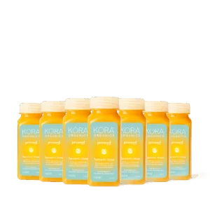
Pressed Juicery Citrus 3 | This refreshing grapefruit mint juice from Pressed Juicery is one of our consistent faves — whether that’s for a cute cocktail or just a quick swig when we’re craving something sweet. Loaded with vitamin C, it helps boost immunity too. CHECK OUT